I recently re-watched Battlestar Galactica (the re-imagined series). I had never watched the end after the season 4 mid-season break. Over all, I liked the series a lot, but wasn't a big fan of the decidedly anti-modernity finale. Do you know what is great? Medicine, and good odds of not dying in your 40s. You know what's even better? Space ships and faster-than-light travel.
Anyway, I don't want to give away spoilers (even thought that wouldn't ruin it for you, so says science). My point of posting is this cool medical display from season 4 (and maybe earlier, I just noticed it in season 4).
I like this display a lot, because it fits in with the general BSG style of keeping things close to current reality, ish. Sure, they have humanoid robots, but they also still use nukes, not photon torpedoes.
I could almost imagine seeing this display today, maybe in a tech company's speculative design video. It appears to incorporate some contemporary data display ideas, like sparklines. My feeling is that in a lot of sci-fi, data displays like this are a lot more cryptic, and hardly seem practical from the view of an analyst. This display, while definitely looking futuristic, also looks like it's all about practicality.
The element that gets the most screen space is the EKG, which animates and bleeps just like in any medical drama.
Then, there are these little widgets.
I believe the larger number is the current heart rate. It updates fairly regularly, going up or down a few beats-per-minute (I missed a whole bunch of dialogue staring at this in the background). The little blue light above the heart rate blinks with every heart beat, or at least every time the display beeps. I don't know what the smaller number represents. I didn't see it update, so it might not represent dynamic data.
Then, there's these three panels, probably small-multiples of some kind.
They're largely static, except they redraw themselves every few seconds. So maybe they could be density distributions over a time interval, or maybe frequency analyses.
Then there are these bars.
This is maybe the most vexing element on the display for me. At first I thought that they might display blood sugar or oxygen relative to some baseline, but you'll notice that at some points, there are bars that go both above and below the baseline. So, they have to be two kinds of measures that are usually in a complementary distribution, but not always. Either way, it seems to clearly be a time series at a relatively large granularity, since it never redraws itself during a scene.
Lastly, there's this strip at the bottom.
It's relatively understated compared to everything else in the display, meaning it can't be any sort of really vital statistic. It looks like maybe a spectral analysis of some kind, or maybe another time series (sleeping and waking time?). This also remains static during scenes.
There are also a lot of elements of the user interface which are very contemporary. Take these boxes for instance.
I think we all know that if you were to press on the screen on one of those triangles, these little boxes would expand to show more information, or contract and hide the information they're currently displaying. This is definitely something that wouldn't have been incorporated into speculative UI designs 20 years ago.
Thursday, September 1, 2011
Sunday, August 28, 2011
Irene!
Well, here in Philadelphia, we've just braved Hurricane Irene. From what I've heard, damage here was relatively minimal, and we haven't lost power. My friends further north in NYC are in my thoughts, cause it looks like they got really hammered.
The silver lining here for me is that I was able to go collect data from the Weather Underground station about six blocks away from where I live. Here are the numbers.
We got 5.68 inches of rain, which fell most steadily between 6PM and midnight last night.
Barometric pressure, on the other hand, hit the floor at 6AM today.
As for wind speeds, there are two measures from the weather station. Speed is, I believe, average wind speed over the reporting time bin (which varies between 1 and 7 minutes...), and Gust is, I believe, the maximum speed during that time bin. Either way, our max wind speeds were around 11PM last night, and they've stayed pretty high into this afternoon.
The silver lining here for me is that I was able to go collect data from the Weather Underground station about six blocks away from where I live. Here are the numbers.
We got 5.68 inches of rain, which fell most steadily between 6PM and midnight last night.
Barometric pressure, on the other hand, hit the floor at 6AM today.
As for wind speeds, there are two measures from the weather station. Speed is, I believe, average wind speed over the reporting time bin (which varies between 1 and 7 minutes...), and Gust is, I believe, the maximum speed during that time bin. Either way, our max wind speeds were around 11PM last night, and they've stayed pretty high into this afternoon.
Tuesday, August 23, 2011
Earthquake: Do your part for data collection!
An earthquake just happened on the East Coast, my first! It turns out the US Geological survey has an online survey for earthquakes called "Did you feel it?" and the data is freely available! So
Go take the survey!
As of now, it looks like survey response has really petered out.
But you can download the data and some graphs here, in the downloads tab.
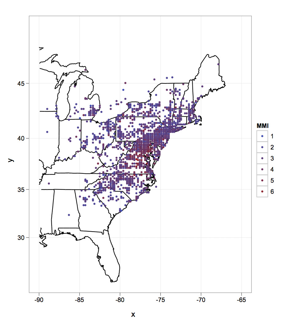
I whipped up this quick visualization of the responses.
Look at that big depressing gap in the response data, right where the epicenter was! And all across Pennsylvania.
If you're from those areas, you really ought to go take the survey!
The real data to download is here. I've already updated the links above.
And here's the real visualizations. Here's the raw data:
And here's mean values across a grid.
Go take the survey!
As of now, it looks like survey response has really petered out.
But you can download the data and some graphs here, in the downloads tab.
I whipped up this quick visualization of the responses.
Look at that big depressing gap in the response data, right where the epicenter was! And all across Pennsylvania.
If you're from those areas, you really ought to go take the survey!
Update
Well, I feel a little stupid. It looks like there are two locations on the USGS site for this earthquake, and the one I was looking at is not up-to-date... Maybe I don't feel so stupid, it's not the best kind of design.The real data to download is here. I've already updated the links above.
And here's the real visualizations. Here's the raw data:
And here's mean values across a grid.
Subscribe to:
Posts (Atom)