Thursday, September 25, 2014

The new iOS Health app is disappointing

I've been getting into using a few different health tracking apps, and have been getting tired of needing to punch the same data into 3 different places every time I step on a scale. So, I was reasonably excited about the new Health app in iOS8, which would act as one central repository for this information that the individual apps could pull from. The fact that release of the HealthKit API has been delayed, meaning my 3 different health apps can't access the Health data yet, is disappointing, but I'm pretty patient about these things.

However, the Health app itself is really disappointing all on its own. It is not a success of data reporting or visualization. For example, here is what the record of the number of steps I've taken each day for the past month looks like.


So, riddle me this: How many steps did I take yesterday? What was the date that I took the most steps? What day of the week was that weird dip? Not only are answers to basic questions like these not "glanceable," they are totally inaccessible. There is, in fact, no way within the Health app to find these answers, but back to that later.

Let's get a bit more detailed. What is the range of the y-axis. It looks like the bottom horizontal like corresponds to 1,500 steps. That's already a questionable data reporting decision. It should probably correspond to 0 steps. How about the top of the y-axis range? The top horizontal like looks like it corresponds to 13,951 steps, but I'm actually pretty sure that is the maximum number of steps in this data. But the maximum data point doesn't touch the top line?

But let's talk about how Apple really failed to meet baseline expectations with these graphs. When I realized I couldn't read the data precisely off the graph, my first instinct was to drag my finger across the line, assuming that more detailed contextual data would pop up. Sort of like how this Google Ngrams graph works. It should even work on mobile if you tap on it. Or, take this excellent bit of interactive visualization from the New York Times Upshot blog. Or any line graph out there with any bit of polish. Users are more or less trained by this point that hovering over line graphs activates some kind of additional contextual information, whether it's more detailed labeling, brushing, or like that NYT visualization, additional graphs! So you might expect that on the baddest touch screen device ever in the world (as Apple would have us believe), there's going to be some wild and crazy touch interaction, pinch-to-zoom pizzazz. Or at least it might have the same baseline functionality as some silly web widget that I can embed in my blog.

No such luck, and the data viz nerd in me sees this as one of the biggest missed opportunities I've seen in a while. It is just a static image, with some minimal transition animations when you switch between different time scales. If you tap on the graph, you get taken to the raw data, which looks like this.


As far as I can tell, this is the really raw data offered up by the motion co-processor. Ludicrously, you can select and delete any individual bout of steps. So, if I felt that actually, one of the 8 groups of steps logged all in the minute of 10:08 AM was inaccurate, I could delete it!

What really frustrates me about the fact that I can see this data is that I can't touch it. Data at this granularity is pointless other than to show off the fact that there's a lot of it. It needs to a little bit aggregated before it gets interesting. And the fact that I don't like the Health visualizations as it is, I'd really go to town on this raw data. But conspicuously absent here is any export utility. I can look at, but not touch my own data. I guess I also couldn't access the data before iOS8, but they didn't waggle it tantalizingly in front of my nose like this!

So sure, maybe someone will make a third party app that will access the data from the HealthKit API and allow me to export it from there. As if what I'm really dying to do is clutter up my phone with an inevitably junky ad riddled app that contributes functionality that really should've been there in the first place.

To sum up, the static figures are poorly designed and minimally informative, but static figures are hardly what I would expect from a corporate entity like Apple anyway. On top of that, waving this raw data in my face is equal parts useless and infuriating.

Sunday, April 13, 2014

Baby Naming Trends: Now With More Linguistics!

This animated graph about the rise in boys names ending in <n> has been making the rounds lately.


It comes from this blog post by David Taylor.

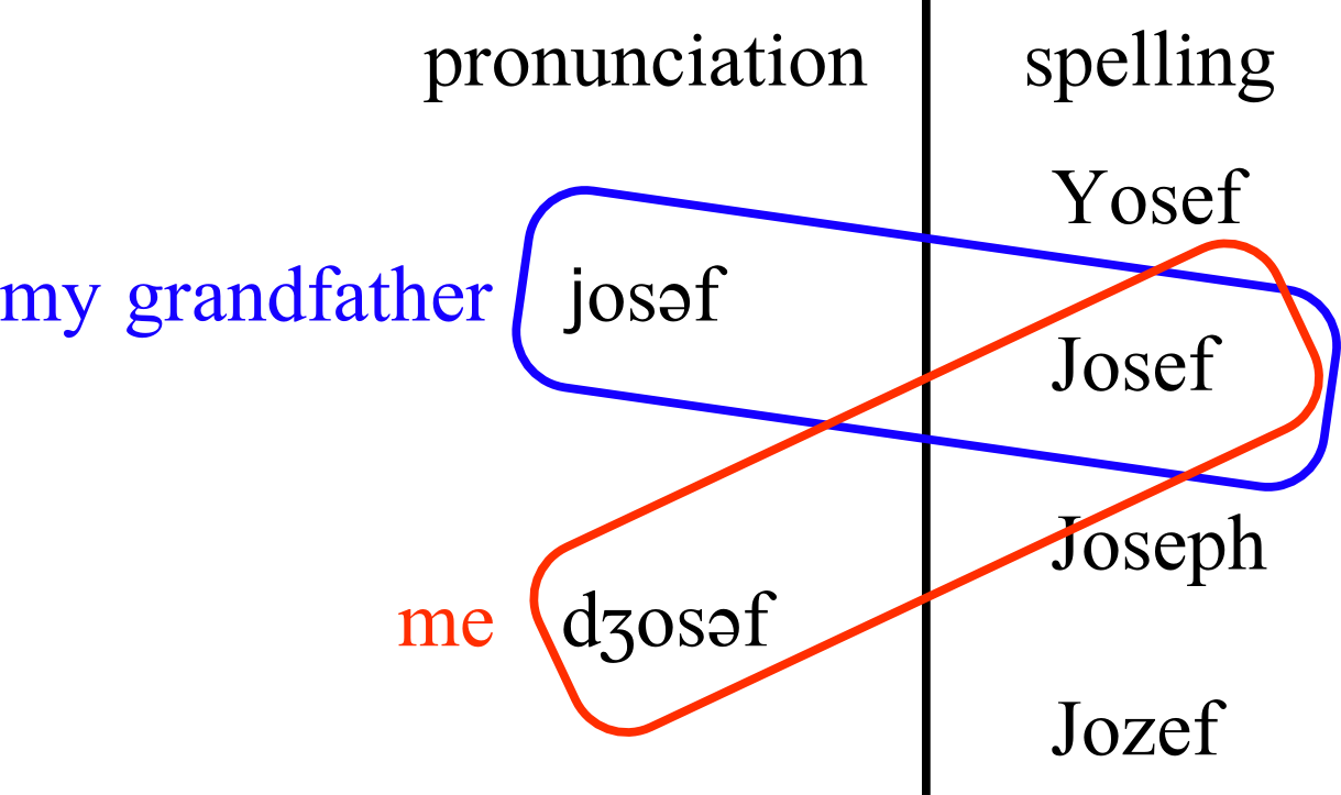
It's a really cool graph, but then, I tend to find analysis of baby names a bit frustrating because they almost always rely strictly on the written, or orthographic, forms of the names. It's not that the way people spell their children's names doesn't matter, but it's half of the puzzle. For example, I'm named after my grandfather. He was German (more specifically, a Donauschwob), so he spelled his name <Josef>, and pronounced the initial sound like <y>, which in the IPA is /j/. When naming me, my parents had a whole bunch of options. Would the pronounce my name like my grandfather did, or like most English speakers would? And how would they spell it? They wound up settling on the English pronunciation, and the German spelling. I've made a little diagram displaying a very partial set of options my parents had in choosing my name.


And of course, Sarah Jessica Parker played a woman named /sændi/ who spelled it <SanDeE☆> in Steve Martin's LA Story, so clearly the spelling of proper names is an important expressive dimension, but still just half the picture.

So, I decided to look at a bit more at popular linguistic structures in baby names. Hadley Wickham has already compiled the top 1000 baby names in the US per year since 1880 (https://github.com/hadley/data-baby-names), and Kyle Gorman has a nice python module that syllabifies CMU dictionary entries (https://github.com/kylebgorman/syllabify). So I put together some sloppy code to analyze it (https://github.com/JoFrhwld/names). The biggest weakness to my approach is the number of names which are not to be found in the CMU dictionary. 2525 out of the total 6782 names in the data (about 40%) aren't in CMU, so this post should be understood as being for entertainment purposes only.

One other thing that bugged me about the name final <n> plot is that it seemed kind of arbitrary to focus on the final letter of the name. I suspect that it's a real trend that people noticed eyeballing lists of names, but that it wasn't compared against other kinds of trends. I went ahead and labeled name initial and name final syllables, codas, onsets and rhymes as being special, but I'm not going to single them out.

Kicking things off, there's a graph of popular syllables between 1880 and 2008. To be included in the graph, a syllable had to be in the top 3 most popular in any given year. The y-axis is how many times more frequent the syllable is than if syllable selection were random. It's not frequency rated, that is, this is just the distribution over names that have that syllable, not babies.
It's a bit chaotic, I know. It's a time like this that I wish I'd learned a little JavaScript so I could make an interactive version with brushing. Here's another version where each syllable gets a facet. They're ordered by their decreasing maximum ratio.
It looks like at the syllable level, name final /nə/ and /li/ for girls are both long time favorites, as well as more popular syllables than any boy's name final /n/ syllable. The most popular boy's name final /n/ syllable looks like it's always been /tən/, but maybe it's flagging a bit compared to the recent surges in /sən/ and /dən/. It also looks like popularity in syllables is pretty evenly split between name initial and name final syllables. For both boys and girls, some kind of initial between /e/ ~ /ɛ/ ~ /æ/ is pretty popular, but I can't be sure what's going on there, because the CMU dictionary has the same entry for both <Aaron> and <Erin>.

But maybe the reason boy's name final /n/ isn't shining through like you might expect is because of phonological reasons. A boy's name ending in a word final syllabic /n/ is necessarily going to pull the preceding consonant into the syllable with it. Looking at the plot above, it's not likely that the preceding consonant is totally random either, cause we've only got /t, s, d/ (all coronals) and vowels preceding the /n/. But for the hell of it, here's the same kind of plot as the ones above, but this time with syllable rhymes.
There's a lot less volatility in the rhymes data, probably because there's fewer different kinds of syllable rhymes. Complex rhymes don't seem to be that popular ever. We've mostly got vowels from open syllables, and syllabic consonants. At any rate, the popularity of name final /n/ for boys is pretty clear, taking over from /i/ (from names like Billy and Jonny). The boy's trend towards name final /n/ seems to be about on par with the trend for girls names to end in /ə/.

I'd like to play around with this data a bit more if I get some time. It occurred to me that you could come up with a few different ways of generating popular names from different eras by randomly sampling popular syllables, or by estimating transition probabilities between syllables and going on a random walk that way.

All my code and the data are up on github, if anyone else wants to play around with it: https://github.com/JoFrhwld/names.

Thursday, January 23, 2014

When did Americans start spelling it "color"?

Usually I wouldn't apologize for a lapse in posting, since I think an obligation to apologize acts as block to actually making another post. But in this case, my hiatus is (loosely) related to the topic.

In September, I defended my dissertation (check it out here if you're so inclined), then hopped on a plane and immigrated to Scotland to start a job as a lecturer in Sociolinguistics at the University of Edinburgh!

The sun was in my eyes. I was feeling very excited.
It's been a fun experience exploring the new cultural landscape. As is usually the case, the differences are more noticeable and surprising than the similarities, but I'm managing more or less. I'm crossing streets with confidence that I know which way the cars are coming from, participating in rounds at pubs (though I'm still not sure I'm doing that right), and thanking the bus driver, which is nice enough to do in the States, is apparently more obligatory here.

One thing I was told by another recent US immigrant to the UK wis that that students appreciate attempts at accommodation to British spelling. So, I'm giving that a shot too, although I'm sure I slip up a bunch, since I'm a very poor copy editor. However, out of passing curiosity, I decided to look at the historical trends in these spelling differences in the Google ngrams, and the patterns seemed interesting enough to warrant this blog post.

First, looking at the American English data for <color> and <colour> there's a very nice and clear cross over from to around 1845, which is about 20 years after Webster's 1828 dictionary, which according to Wikipedia is what we have to blame these differences on. Once you start trying to add more <-or ~ -our> to the graph, it gets chaotic fast, so instead of plotting out each word, I'll plot out the percent of <-or> spelling using Google ngram's handy arithmetic functions. (I've also included color/color, just to anchor the top of the range at 100%) I don't think I should have been, but I was a bit surprised with the uniformity with which the <-or> spelling replaced the <-our> spelling across all of these words. The trends seems to kick off around the 1820s, consistent with blaming it on Webster's dictionary, and increased till reaching its plateau around 1860.

But of course, <-or ~ -our> spelling isn't the only difference between British and American systems. The next set of consistent spelling differences involve <-er ~ -re>. Here are those words plotted out, with <color ~ colour> and <humor ~ humour>left in there as a representative items of the <-or ~ -our> set. So, it seems like there is a similar uniformity within the <-er ~ -re> words (maybe saber and theater are lagging behind) but the <-re→-er> replacement is offset from the <-our→-or> by about 60 years or so.

Of course, I shouldn't have been surprised, because I know how a little bit about language change, but it was fun to see this thing that I think of being a uniform "American Spelling" is actually the result of multiple changes that didn't happen all at the same time.

Just for fun, I took a look at what these patterns look like in British English. So, it looks like there might be a bit of a creep of American spellings into British English, but interestingly, the particular alternations aren't differentiated. So while the end product of "American Spelling" appears to be the result of an accumulation of different changes, the borrowing of American spelling into British English is being done holistically.

Disqus for Val Systems