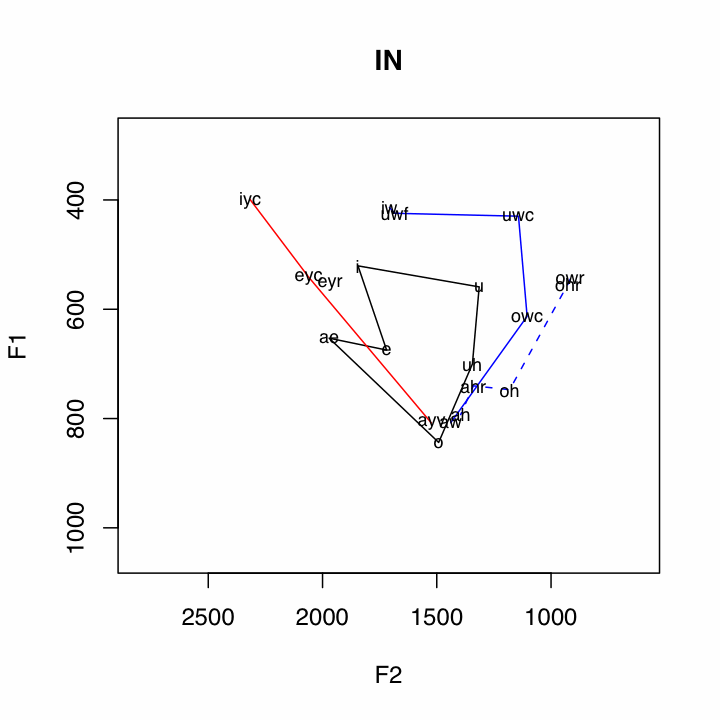
The output of the script looks like this:

It produces a plot like this for every dialect region and for every speech community in that dialect region.
I think the greatest strength of this way of plotting subsystems is the representation of the short vowel system. You can very clearly see the Northern Cities Shift, the Canadian Shift, and the Pittsburgh Shift (apparently not isolated to Pittsburgh).
Other relationships aren't as immediately clear, though. My goals for the future are to work out some plotting mechanisms to make other relationships of interest more clear, such as the relationship of tense-lax pairs, or perhaps highlighting of mergers splits and oppositions of particular interest.
I'd also like to work out how to incorporate information about other dimensions of vowel data, such as duration. The best idea I've had about incorporating vowel duration data in F2xF1 plots involved utilizing gray scales (inspired by Visual Display of Quantitative Information), but there are a lot more details to work out on that.
No comments:
Post a Comment