Saturday, July 16, 2011

More Dialects and Communication Density

I'm not sure if it was there before, but there's a tab on the Senseable Cities lab's Connected States of America page with some of their data. Specifically, they provide an .svg of the United States with ID numbers which are cross referenced to .csv files, which label the calling and sms-ing communities. Hopefully, they'll also publish rawer data eventually.

Data munging

So, I took some of the Atlas of North American English data which labels cities and their dialect classification. I don't think I'll look at finer grained ANAE data, like particular vowels' quality, because I don't think that would be too great with the the granularity of the data available from Senseable. I had to associate city names with counties to merge the data with the .svg, and thankfully Google Refine + Freebase was able to get me 2/3 of the way there. There are a few strange errors in the .svg file that no amount of automation was going to get around ("Orandge County, FL" Really?). I also pulled the coordinate data out of the .svg so that I could do this all in R, which is where I feel the most comfortable.

For the ANAE data, I collapsed some sub-dialects together, like Inland North and North, and Inland South and South.

Mis-match Measure

So, I have counties with dialect classification, and counties with calling and sms-ing classifications. I want to come up with a way of evaluating the mis-match between these. Here's a sketch of how I did that.

for D in Dialects:
     for C in Calling_Communities:
          Within = D ∪ C
          Outside = C - D
          ratiod,c = |Outside|/|Within|

So, "Within" is the set of counties that are both in dialect D and calling community C. "Outside" is the set of counties that are in calling community C and in some other dialect than D. You might have thought that I'd also include the set of counties that are in dialect D and in some other calling community than C, but that's actually not so important. As I said before, these dialect regions are rather large, so I'd expect there to be many calling communities within one dialect. What's stranger is calling communities which span dialects.

So, for interpreting the ratio, as it reaches 0 or ∞, the fit between dialects and calling communities is pretty good. At 0, a calling community is contained entirely within a dialect. As it approaches ∞, a dialect is more and more marginally part of a calling community.

Next step, I took abs(log(ratiod,c)). Now I have a measure that runs from 0 to ∞, and the closer it is to 0, the bigger the mismatch. I also wanted to boost the match score of smaller dialect regions. I forget why, but it made sense at the time. So, I weighted these absolute log-odds by 1/|D|.

Results

Here are the median results per dialect compared to calling communities, from best to worst match:

  1. West - ∞
  2. St. Louis Corridor - 0.45
  3. Florida - 0.35
  4. Western New England - 0.19
  5. Eastern New England - 0.08
  6. Western PA - 0.07
  7. Texas - 0.06
  8. South - 0.03
  9. North - 0.02
  10. Midland - 0.01
  11. Mid-Atlantic - 0
  12. NYC - 0
And for the sms data:
  1. West  - ∞
  2. South - ∞
  3. St. Louis Corridor- 0.5
  4. Florida - 0.34
  5. Eastern New England - 0.17
  6. Western New England - 0.15
  7. Western PA - 0.07
  8. Texas - 0.06
  9. Midland - 0.05
  10. North - 0.02
  11. Mid-Atlantic - 0
  12. NYC - 0
I'd not put so much stock into the Mid-Atlantic and NYC scores. To a large degree this is due to them cannibalizing each other, and they're not that different dialectally anyway.

What's really interesting is the poor Midland and Northern scores. While I haven't worked out a measurement for which dialects are most mixed within calling communities, I suspect their poor scores are related to each other. 

Graphs!

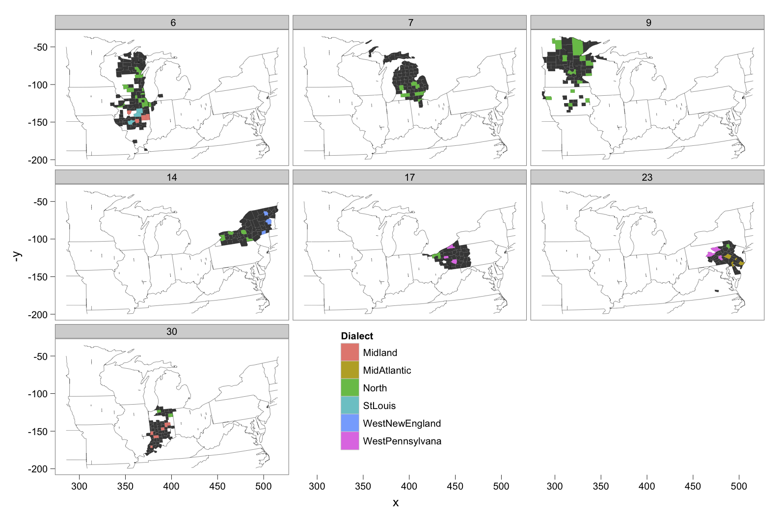
In this first graph, each facet is for a calling community in which there is a Northern dialect county. The filled in bits are the counties which are within the calling community, and the colored counties are ones we have dialect data for.

Calling data
In 4 out of 7 calling communities in which there is a northern dialect county, there is also a Midland dialect county. That's basically along the entire border region between the two dialects.

Here's the same graph for sms-ing communities.
SMS data

Conclusions

Yup, these communication communities don't line up with dialect boundaries like you'd expect.

Monday, July 11, 2011

Communication Density and Dialect Boundaries

One linguistics topic which non-specialists are almost always interested in is dialect geography, and I don't think that's strictly due to their desire to have regional biases confirmed. It seems like almost everybody has a genuine interest in where and how people speak differently from themselves. Granted, once you move away from fairly shallow lexical differences into phonetic and phonological ones, a lot of people's eyes glaze over.

When it comes explaining why dialect boundaries are in one place, rather than another, dialect geographers tend to have two answers. First, different regions have different historical settlement patterns. Bill Labov frequently points out that the current phonological boundary between the North and the Midland in the United States coincides with boundary between where log cabins were built versus A-frame houses, which itself coincides with two different immigration streams with different points of origin on the East coast.

Second, there are differential rates of communication between regions. Langauge appears to be transferred crucially by face-to-face communication. If two regions have stronger ties of communication between themselves than with other regions, then we think they're probably going to have more similar dialects. This was basically Keelan Evanini's argumentation about why Erie, PA basically has a Western Pennsylvania dialect, even though it had historically been part of the North.

Given this second hypothesis about why dialect boundaries exist where they do, I was pretty excited to see these results coming out of the Senseable City Lab, which in collaboration with AT&T and IBM Research, has produced maps illustrating how US counties cluster together in terms of cell phone traffic and sms traffic.

The lines between communication clusters are exactly those that I would expect to define dialect boundaries. So, I took the call and sms community maps, and superimposed the major dialect boundaries from the Atlas of North American English. Here are the results.

Communication clustering by Calls

Communication Clustering by SMS

Honestly, I'm a little disappointed with the outcome. I expected that for very large dialect regions, like the West and the South, they would would contain many different communication clusters, so that's fine. Where both a dialect boundary and a communication boundary line up with a state boundary, I don't think it should be counted as an alignment. If there's any tendency for people to be more likely to move within state lines than across state lines, then this alignment along state lines is probably better explained by the first factor, settlement history, than communication density.

The crucial place to look for an alignment between communication and dialects seems to be the Ohio, West Virgina, Pennsylvania trifecta. In neither map does it look like communication density lines up quite right. Certainly, Pennsylvania is cut in half into a Western and Eastern region, but it seems like the Western PA dialect extends further East, almost to the threshold of Philadelphia.

Ohio doesn't seem to be sliced up quite right either. In the calls data, Cleveland clusters with the rest of the state, while with the SMS data, it clusters with Western PA. Dialectally, Cleveland is neither like the rest of Ohio nor Western PA. Rather, it is more similar to Toledo and Detroit to the West, and Buffalo to the East.

There are other unfortunate non-alignments, like how Baltimore is clustered with Virginia, while dialectally it's more similar to Philadelphia, and New England isn't chopped up communicationally the way it is dialectally.

I'll conclude by saying that first, pat answers to explain natural phenomena don't always work out, and second, these communication clusters make some dialect boundaries pretty mysterious. If everyone in Ohio is clustered together into a cell phone calling community, then why don't they all talk the same? The answer to this probably has to do with a third factor: meaningful social divisions which are distinct from communication divisions, but remember what I said about pat answers?

Sunday, July 10, 2011

Estimated international population of gay men

I recently learned about the "fraternal birth order effect," where apparently for every older brother a man has, his probability of being gay as an adult increases. Here's a wikipedia entry.

Now, apparently there's some debate over how real or how strong this effect really is, so I'm almost certainly taking some numerical result a little too seriously. But, it occurred to me that data such as total fertility rate, and birth sex ratios are attainable international statistics. If this fraternal birth order effect is pretty strong and reliable, you should be able to estimate what percent of the male population of a country is gay.

So, I grabbed some data on international total fertility rate from here, and data on birth sex ratios here. Now, I have to make some assumptions. First, all of these calculations take the average total fertility rate as a country level descriptor, but there's almost certainly a unique probability distribution for different fertility rates for every country. Second, I have to treat the probability of having a male baby as being independent from the sex of the prior babies a woman has had. Third, and most importantly, I'm treating fraternal birth order as the only determinant of sexual orientation.

These are all pretty drastic assumptions. For instance, there's some evidence that my second assumption (birth sex of babies from the same mother are independent processes) is false. From the UN data I have, here's the total fertility rate of the country by the sex ratio:


This seems to suggest that as women have more babies, they're more likely to have girls. Note: I've left out data from four countries with highly skewed birth sex ratios, since these countries apparently have high rates of abortion of female fetuses.

So, I'm thinking about this as a very rough back of the envelope estimate, not to be taken too seriously, but maybe some sort of indicator of the shape of the world.

Here's the math:

  • babies = 1, 2, ... total.fertility.rate
  • boy.probability = male.ratio/2
  • boy.babies = boy.probability^(babies)
  • prob.gay.first.born = 0.12 (more on this below)
  • prob.gay.n.born = prob.gay.n-1.born * 1.3 (from wikipedia)
  • prob.gay = sum(prob.gay.1-to-n.born * boy.babies)
I hope that makes some sense. I grabbed 1.3 from wikipedia, which says "each older brother increases a man's odds of developing a homosexual orientation by 28–48%." I basically made up the probability that a first born son is gay. This was the one number that I couldn't seem to find, so I adjusted and played with it until the predicted percent of gay men in the United States was about 10%.

Here are my results for the top 10 countries for percent of gay men.
  1. Afghanistan (19%)
  2. Niger (18%)
  3. Liberia (18%)
  4. Mali (18%)
  5. Nigeria (18%)
  6. Burkina Faso (17%)
  7. Guinea (17%)
  8. Yemen (17%)
  9. Iraq (17%)
  10. Uganda (17%)
Unsurprisingly, the percent of gay men in a country is highly correlated with total fertility rate. I think this top 10 list highlights the importance of gay rights activism in Africa, especially in Uganda, which is considering making homosexuality a capital offense. 

And for the self obsessed, the United States looked like this:
  • Smaller percent than 100 countries > tied with 17 countries > larger percent than 43.

Disqus for Val Systems