Wednesday, October 1, 2014

America's Ugliest Accent: Something's ugly alright.

I should really blog more often, instead of just when I feel compelled to slap down some nonsense, because the general tone of Val Systems turns towards scolding and away from my genuine positive passion for linguistics. That said, guess what I'm doing in this post!


If you read past the headline, it gets even worse. I won't always reply to examples I find of gross linguistic discrimination like this, because if I did it'd be a full time job. But I noticed that in the introduction they'd linked to a New York Times column that references a paper that I co-authored on the Philadelphia dialect. I didn't think the NYT column was appropriately respectful, and I said so on Language Log at the time.

The NYT columnist wasn't too happy about what I said, but I feel that I have an ethical obligation to the people who invite us into their homes and are generous with their time and stories, to provide them with a vigorous public defense if their communities and the way they speak are ridiculed as a result. Moreover, language shaming pieces like this Gawker tournament only poison the waters for future sociolinguistic research, especially if our names as researchers are attached onto them in some way.

And as I was writing up some notes for this response, and followed more links from the Gawker pieces, I was really shocked by how many articles they've linked to that are popular writeups of sociolinguistic research, usually including interviews with one or more sociolinguists! It's like half my facebook friends list in there! It feels so defeating to see these generally positive articles and interviews utilized to prop up an exercise as ugly and mean spirited as this one.

But what's the harm...?

Anticipating some reactions to this post, no, I'm not some grey humorless lump. But just because something is framed as a game doesn't make it fun, and it doesn't make it funny. For example, take Gawker's paragraph about New Orleans:
New Orleans is a steaming, fetid stew of aural bile, home to everything from the deep Cajun bayou accent to the Yat dialect, which derives from Irish, French, German, and even Italian into one completely incomprehensible mess. You need only watch this clip on the number of ways residents pronounce the city's name and neighborhoods and read this excellent article on the hodgepodge of New Orleans' accents to see how varied, and uniformly ugly, it all is.
lol?

Even if there was some intrinsic humor to that paragraph, instead of just raw nastiness, it would be important to reflect on who we're making fun of, and why. And on that count, I think the fella who compiled the Yat dictionary summarizes it well:
It's a working class language, probably, is what it amounts to.
And of course, that's what linguistic discrimination is really about. Maybe it's not always about class, but it's never really about language. It's about the kind of people who speak it. Predictably, the kinds of accents and languages which get dumped on the most, and get branded the "ugliest," always wind up being spoken by socially disadvantaged people. What exactly did this woman in particular do to deserve having a candid video of her slapped up on Gawker as an example of just how "ugly" the Chicago accent is? She works in a warehouse supermarket, that's what.

And this isn't a consequenceless game either. "America's Ugliest Accent Tournament" just puts a laughing face on a serious problem of discrimination that has economic and personal consequences for real people. To choose one example I'm familiar with, Anita Henderson did a study where she surveyed hiring managers in Philadelphia, playing them tapes of potential job applicants, and asked them to rate them on their job suitability. The topline summary from the abstract:
Those who sound Black are rated as less intelligent and ambitious and less favorably in job level.
In her textbook English with an Accent, Rosina Lippi-Green sums up my own opinion on the matter, but I've added some emphasis.
If as a nation we are agreed that it is not acceptable or good to discriminate on the grounds of skin color or ethnicity, gender or age, then by logical extension it is equally unacceptable to discriminate against language traits which are intimately linked to an individual's sense and expression of self

How's this different from these other examples?

A few of the supporting links from the Gawker piece are personal websites that are called "How to talk [City]" or "The [Dialect] Dictionary," put together by enthusiastic speakers of the area themselves. They tend to have a self deprecating tone, so isn't that similar to the Ugliest Accent Tournament? It sure as hell isn't! First of all, even if those personal sites do have a poking fun tone, the fact is the dialect must be important to the person putting together the site, or else they wouldn't have spent the time documenting it! Their self deprecating tone could either be due to the general difficulty of expressing seriously how important a topic is to you, or to their internalized linguistic insecurities driven by things like America's Ugliest Accent Tournament. Moreover, Gawker is a really large media organization, and should be taken to task if only due to their profile and influence.

Sociolinguists ask people what they think about accents and dialects too. It's a subfield sometimes called Perceptual Dialectology. Isn't that kind of the same? Don't even start! A goal of sociolinguists is to understand the social landscape of language as well as we can, and that includes people's sometimes crummy attitudes about it. But if we have a goal, it's to critique those attitudes, not revel in them in some kind of user engagement experiment so that we can go cash in our pageviews with advertisers.

The Fundamental Sociolinguistic Outlook

Real quick, let's contrast the overall tone of the America's Ugliest Accent Tournament with what I would call the fundamental sociolinguistic outlook on speakers. I think Bill Labov summed it up nicely at the end of his 2009 Haskins Prize lecture (go listen to it if you haven't already).

Versus Gawker
No matter who you are, you all sound disgusting.

What to do about it?

I for one will be writing a polite e-mail to Gawker asking them to remove the link that references my research, and to avoid linking to anything that references my research in the future. I'd encourage anyone else whose research they mentioned to do the same.

Thursday, September 25, 2014

The new iOS Health app is disappointing

I've been getting into using a few different health tracking apps, and have been getting tired of needing to punch the same data into 3 different places every time I step on a scale. So, I was reasonably excited about the new Health app in iOS8, which would act as one central repository for this information that the individual apps could pull from. The fact that release of the HealthKit API has been delayed, meaning my 3 different health apps can't access the Health data yet, is disappointing, but I'm pretty patient about these things.

However, the Health app itself is really disappointing all on its own. It is not a success of data reporting or visualization. For example, here is what the record of the number of steps I've taken each day for the past month looks like.


So, riddle me this: How many steps did I take yesterday? What was the date that I took the most steps? What day of the week was that weird dip? Not only are answers to basic questions like these not "glanceable," they are totally inaccessible. There is, in fact, no way within the Health app to find these answers, but back to that later.

Let's get a bit more detailed. What is the range of the y-axis. It looks like the bottom horizontal like corresponds to 1,500 steps. That's already a questionable data reporting decision. It should probably correspond to 0 steps. How about the top of the y-axis range? The top horizontal like looks like it corresponds to 13,951 steps, but I'm actually pretty sure that is the maximum number of steps in this data. But the maximum data point doesn't touch the top line?

But let's talk about how Apple really failed to meet baseline expectations with these graphs. When I realized I couldn't read the data precisely off the graph, my first instinct was to drag my finger across the line, assuming that more detailed contextual data would pop up. Sort of like how this Google Ngrams graph works. It should even work on mobile if you tap on it. Or, take this excellent bit of interactive visualization from the New York Times Upshot blog. Or any line graph out there with any bit of polish. Users are more or less trained by this point that hovering over line graphs activates some kind of additional contextual information, whether it's more detailed labeling, brushing, or like that NYT visualization, additional graphs! So you might expect that on the baddest touch screen device ever in the world (as Apple would have us believe), there's going to be some wild and crazy touch interaction, pinch-to-zoom pizzazz. Or at least it might have the same baseline functionality as some silly web widget that I can embed in my blog.

No such luck, and the data viz nerd in me sees this as one of the biggest missed opportunities I've seen in a while. It is just a static image, with some minimal transition animations when you switch between different time scales. If you tap on the graph, you get taken to the raw data, which looks like this.


As far as I can tell, this is the really raw data offered up by the motion co-processor. Ludicrously, you can select and delete any individual bout of steps. So, if I felt that actually, one of the 8 groups of steps logged all in the minute of 10:08 AM was inaccurate, I could delete it!

What really frustrates me about the fact that I can see this data is that I can't touch it. Data at this granularity is pointless other than to show off the fact that there's a lot of it. It needs to a little bit aggregated before it gets interesting. And the fact that I don't like the Health visualizations as it is, I'd really go to town on this raw data. But conspicuously absent here is any export utility. I can look at, but not touch my own data. I guess I also couldn't access the data before iOS8, but they didn't waggle it tantalizingly in front of my nose like this!

So sure, maybe someone will make a third party app that will access the data from the HealthKit API and allow me to export it from there. As if what I'm really dying to do is clutter up my phone with an inevitably junky ad riddled app that contributes functionality that really should've been there in the first place.

To sum up, the static figures are poorly designed and minimally informative, but static figures are hardly what I would expect from a corporate entity like Apple anyway. On top of that, waving this raw data in my face is equal parts useless and infuriating.

Sunday, April 13, 2014

Baby Naming Trends: Now With More Linguistics!

This animated graph about the rise in boys names ending in <n> has been making the rounds lately.


It comes from this blog post by David Taylor.

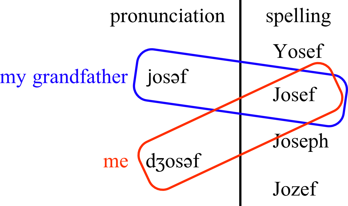
It's a really cool graph, but then, I tend to find analysis of baby names a bit frustrating because they almost always rely strictly on the written, or orthographic, forms of the names. It's not that the way people spell their children's names doesn't matter, but it's half of the puzzle. For example, I'm named after my grandfather. He was German (more specifically, a Donauschwob), so he spelled his name <Josef>, and pronounced the initial sound like <y>, which in the IPA is /j/. When naming me, my parents had a whole bunch of options. Would the pronounce my name like my grandfather did, or like most English speakers would? And how would they spell it? They wound up settling on the English pronunciation, and the German spelling. I've made a little diagram displaying a very partial set of options my parents had in choosing my name.


And of course, Sarah Jessica Parker played a woman named /sændi/ who spelled it <SanDeE☆> in Steve Martin's LA Story, so clearly the spelling of proper names is an important expressive dimension, but still just half the picture.

So, I decided to look at a bit more at popular linguistic structures in baby names. Hadley Wickham has already compiled the top 1000 baby names in the US per year since 1880 (https://github.com/hadley/data-baby-names), and Kyle Gorman has a nice python module that syllabifies CMU dictionary entries (https://github.com/kylebgorman/syllabify). So I put together some sloppy code to analyze it (https://github.com/JoFrhwld/names). The biggest weakness to my approach is the number of names which are not to be found in the CMU dictionary. 2525 out of the total 6782 names in the data (about 40%) aren't in CMU, so this post should be understood as being for entertainment purposes only.

One other thing that bugged me about the name final <n> plot is that it seemed kind of arbitrary to focus on the final letter of the name. I suspect that it's a real trend that people noticed eyeballing lists of names, but that it wasn't compared against other kinds of trends. I went ahead and labeled name initial and name final syllables, codas, onsets and rhymes as being special, but I'm not going to single them out.

Kicking things off, there's a graph of popular syllables between 1880 and 2008. To be included in the graph, a syllable had to be in the top 3 most popular in any given year. The y-axis is how many times more frequent the syllable is than if syllable selection were random. It's not frequency rated, that is, this is just the distribution over names that have that syllable, not babies.
It's a bit chaotic, I know. It's a time like this that I wish I'd learned a little JavaScript so I could make an interactive version with brushing. Here's another version where each syllable gets a facet. They're ordered by their decreasing maximum ratio.
It looks like at the syllable level, name final /nə/ and /li/ for girls are both long time favorites, as well as more popular syllables than any boy's name final /n/ syllable. The most popular boy's name final /n/ syllable looks like it's always been /tən/, but maybe it's flagging a bit compared to the recent surges in /sən/ and /dən/. It also looks like popularity in syllables is pretty evenly split between name initial and name final syllables. For both boys and girls, some kind of initial between /e/ ~ /ɛ/ ~ /æ/ is pretty popular, but I can't be sure what's going on there, because the CMU dictionary has the same entry for both <Aaron> and <Erin>.

But maybe the reason boy's name final /n/ isn't shining through like you might expect is because of phonological reasons. A boy's name ending in a word final syllabic /n/ is necessarily going to pull the preceding consonant into the syllable with it. Looking at the plot above, it's not likely that the preceding consonant is totally random either, cause we've only got /t, s, d/ (all coronals) and vowels preceding the /n/. But for the hell of it, here's the same kind of plot as the ones above, but this time with syllable rhymes.
There's a lot less volatility in the rhymes data, probably because there's fewer different kinds of syllable rhymes. Complex rhymes don't seem to be that popular ever. We've mostly got vowels from open syllables, and syllabic consonants. At any rate, the popularity of name final /n/ for boys is pretty clear, taking over from /i/ (from names like Billy and Jonny). The boy's trend towards name final /n/ seems to be about on par with the trend for girls names to end in /ə/.

I'd like to play around with this data a bit more if I get some time. It occurred to me that you could come up with a few different ways of generating popular names from different eras by randomly sampling popular syllables, or by estimating transition probabilities between syllables and going on a random walk that way.

All my code and the data are up on github, if anyone else wants to play around with it: https://github.com/JoFrhwld/names.

Disqus for Val Systems